
A shelf is either working for the room or working against it. When it is styled well, it gives the eye somewhere to rest, introduces texture and personality, and makes the room feel finished. When it is styled badly, or not styled at all, it becomes visual clutter: a row of things that happen to be there because nobody decided otherwise.
The difference between a shelf that looks considered and one that looks cluttered is rarely about the objects themselves. It is about spacing, grouping, height, and restraint. Knowing how to style a shelf is less about having the right things and more about knowing how to arrange whatever you have.
This guide covers the principles that work on any shelf: floating shelves, built-in bookcases, sideboards, mantels, and open kitchen shelving.
The Rule of Odds
Groups of odd numbers look more natural than even numbers. This is not a design opinion. It is a principle rooted in how the human eye processes visual information. A group of three objects reads as a composed arrangement. A group of four reads as two pairs, which the eye tries to split apart rather than hold together.
On a shelf, this means grouping objects in ones, threes, or fives. A single Cognac Step Vase on its own makes a statement. Three pieces from the Bare Collection in a row create a curated grouping. Five objects spread across a long shelf establish a rhythm. Two objects side by side tend to look like they are waiting for a third.
The exception is deliberate symmetry: two matching candlesticks flanking a vase, or two identical objects bookending a shelf. This works because the symmetry is the point, and the eye understands the pattern immediately.

Height Variation
A shelf where every object is the same height looks flat, regardless of how interesting the individual pieces are. The eye moves in a straight line across the top of the objects and then stops. There is no visual journey.
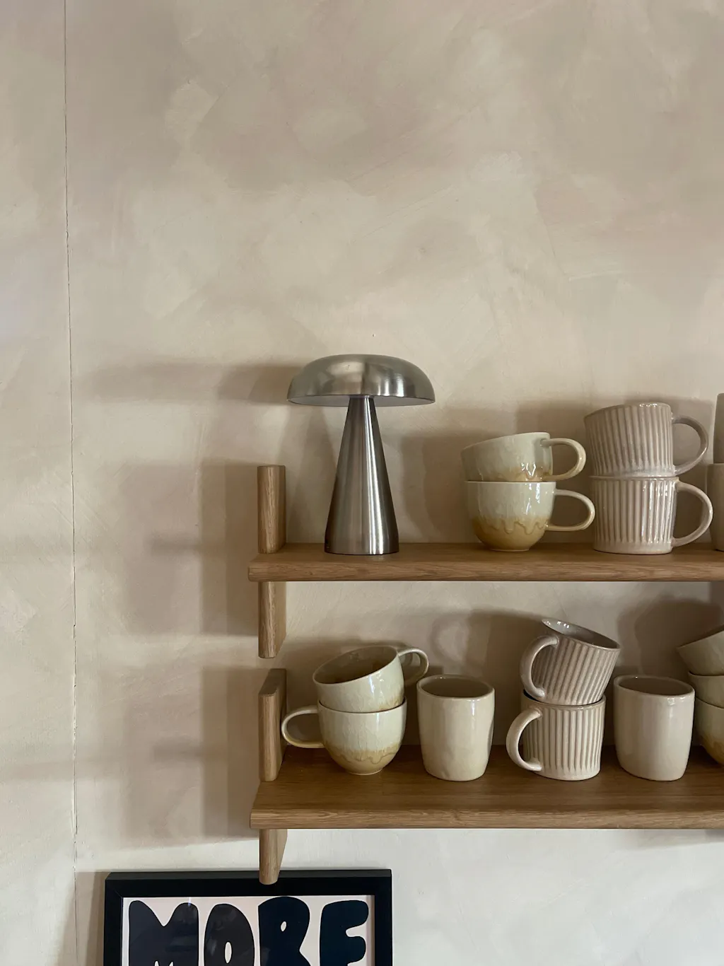
Creating height variation is the single most effective thing you can do to make a shelf look styled rather than stacked. Place a tall object (a vase, a candle holder, a book standing upright) next to a low object (a small ceramic, a tray, a plant pot), with a mid-height piece between them. This creates a visual triangle that the eye follows naturally.
On a single floating shelf, aim for at least two different heights. On a bookcase with multiple shelves, vary the rhythm shelf by shelf: tall left on one shelf, tall right on the next. This prevents the overall composition from feeling lopsided.
A Snout Vase at 14cm beside a Dented Vase at 7cm is a practical example: one tall, one low, both in the same material family. Add a Bare Candlestick Holder at 7cm beside the taller vase and you have three heights with a natural connection between the pieces.

Negative Space
The empty space on a shelf is not wasted space. It is what makes the objects readable. Without it, everything bleeds together and nothing stands out.
A useful benchmark: aim for 30% to 40% of the shelf surface to be empty. This gives each object room to breathe and lets the shelf itself (its material, its edge, its relationship to the wall) contribute to the composition rather than disappearing under the objects.
Negative space also provides visual relief across a room. In a Japandi living room especially, where restraint is a defining characteristic, a shelf that is 60% full reads as considered. A shelf that is 90% full reads as a storage problem, no matter how carefully the objects were chosen.
If you find yourself running out of space, the answer is almost always to remove something rather than rearrange. The piece you remove will probably find a better home somewhere else in the room.
Layering: Front to Back
Shelves have depth as well as width, and using that depth creates a sense of dimension that flat, single-row arrangements cannot achieve.
The simplest layering technique is to place something flat at the back (a small print leaning against the wall, an organic mirror, or a book turned spine-in for a block of neutral colour) and then place smaller objects in front of it. This creates a foreground and background within a few centimetres, which tricks the eye into reading the shelf as having more dimension than it does.
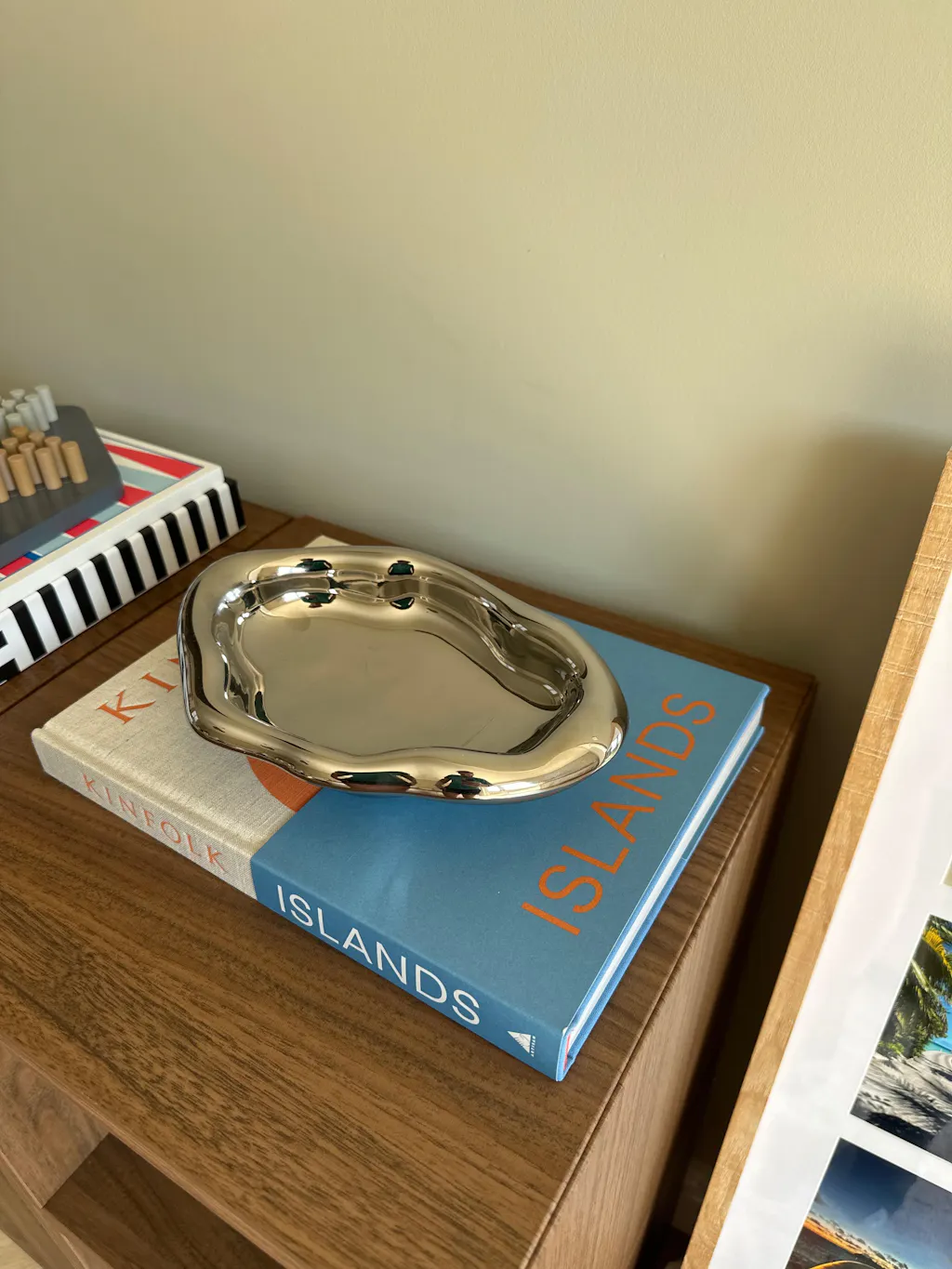
On deeper shelves (20cm or more), you can create a proper two-layer arrangement. A row of books at the back with a small vase or candle in front of them. A framed print with a ceramic plant pot positioned slightly forward and to one side. The key is that the front object does not completely block the back one. Partial concealment creates interest. Complete concealment creates a shelf that looks like it has less on it than it does.

Material Mixing
A shelf full of objects in the same material looks uniform, which reads as either intentional (a collection) or accidental (everything was bought from the same place at the same time). For most shelf arrangements, mixing two or three materials creates more visual interest than staying in one family.
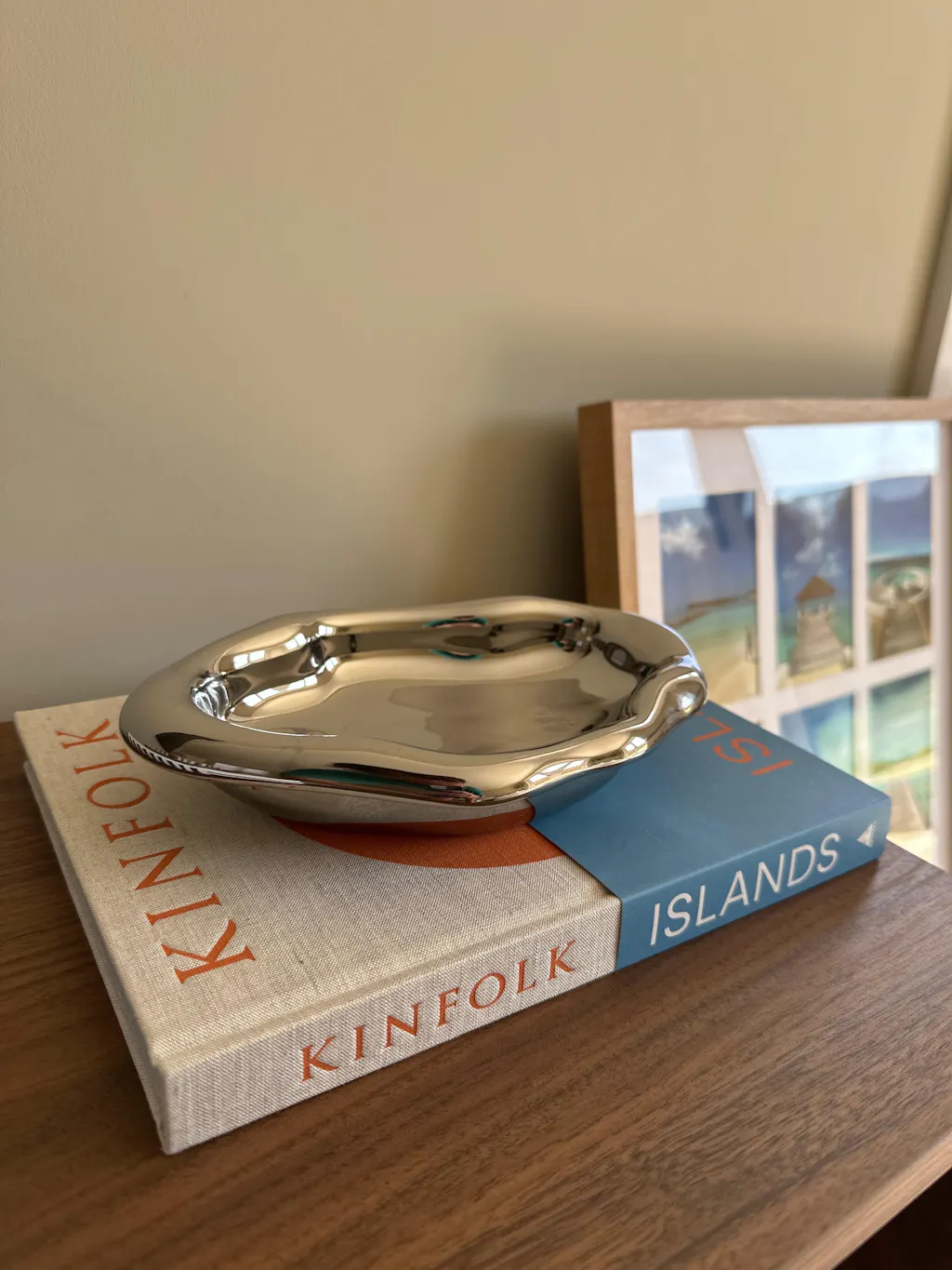
The most effective combinations pair a matte finish with a reflective one: raw ceramic next to polished metal, a linen spine next to a glass object. A handmade ceramic vase beside a chrome tray is a good example. The matte, irregular surface of the ceramic gains definition against the polished, flat surface of the chrome. Each material makes the other more visible.
Wood is the universal connector. A wooden shelf connects ceramic, metal, glass, and fabric objects without needing them to relate directly to one another. A woven wooden surface does the same thing with added textural warmth. If your arrangement feels disconnected, wood or woven natural fibre between the objects often solves it.

Styling by Shelf Type
Floating Shelves
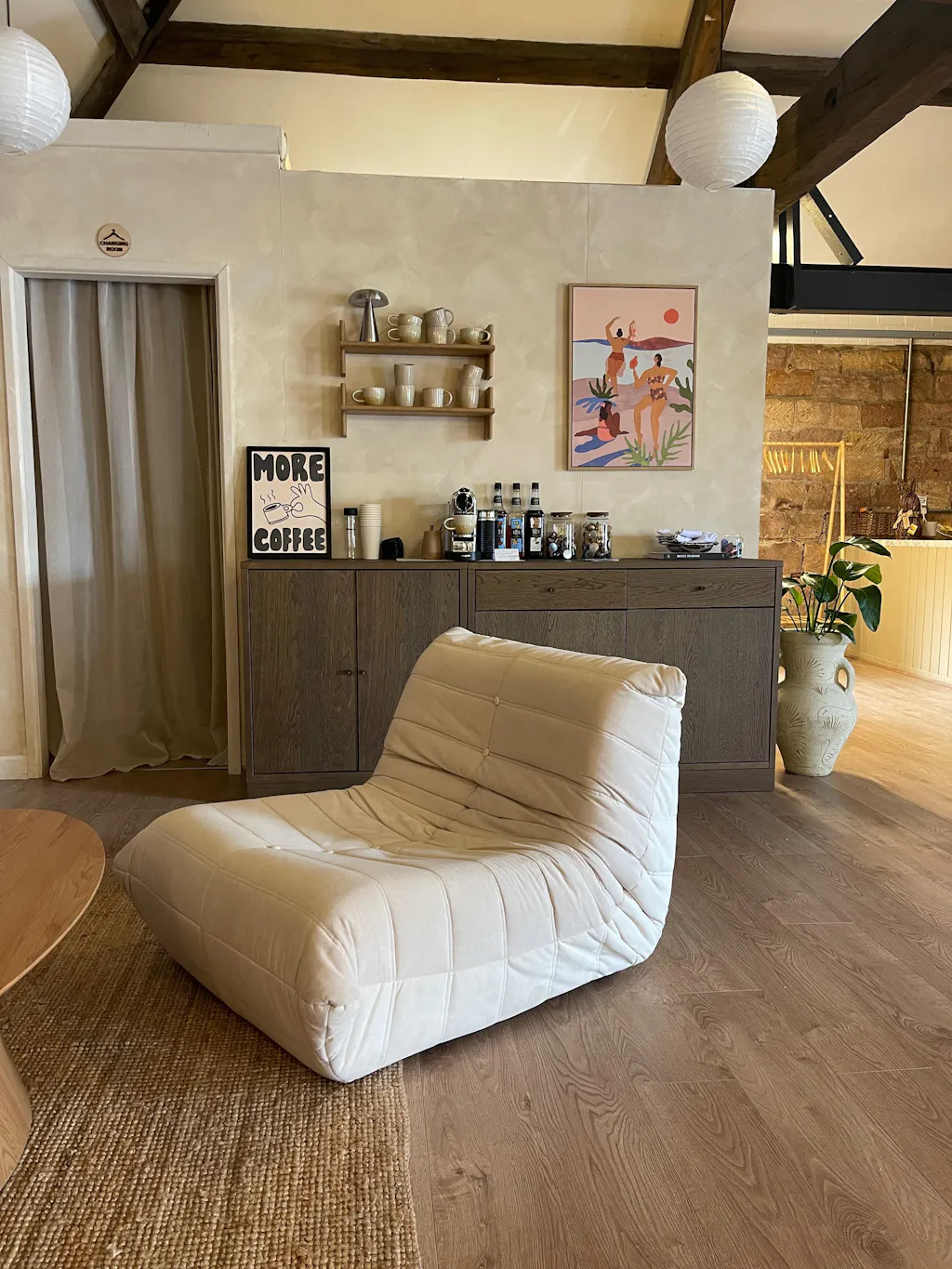
A single floating shelf is a composition in miniature. It has limited surface area (typically 60cm to 90cm wide, 15cm to 20cm deep), so restraint is essential. Three to five objects maximum. One tall, one low, something leaning at the back if the depth allows. A single Cognac Step Vase with a small plant pot and a candle makes a complete arrangement on a floating shelf without crowding it.
If you have a stack of two or three floating shelves, treat them as one composition rather than three separate ones. Alternate the visual weight: heavier grouping on one shelf, lighter on the next. This creates rhythm across the vertical space.
Bookcases
A bookcase full of books needs no styling. Books are objects in their own right, and a densely packed bookcase has its own beauty. The styling question arises when the bookcase is not full, or when you want to break up rows of spines with other objects.
The most effective approach is to treat each shelf as a zone. Some shelves are for books (stacked vertically or horizontally). Some are for objects. Some combine both. On a five-shelf bookcase, two shelves of books, two of mixed books and objects, and one of objects alone creates a balanced composition that reads as both functional and considered.
Horizontal book stacks (two or three books laid flat) make excellent plinths for smaller objects. A silver candle holder on a short stack of books gains height and context. The books become part of the arrangement rather than just storage.
Sideboards and Mantels
A sideboard or mantelpiece is essentially a wide, shallow shelf at mid height. The same principles apply: odd numbers, height variation, negative space. But the larger surface area (often 120cm or more) means you can afford a more generous arrangement.
The classic sideboard composition: one tall piece at one end (a vase, a lamp, a tall candle holder), a low grouping in the centre (a tray with small objects, a short stack of books), and one mid-height piece at the other end (a plant, a sculptural object). Leave the remaining third of the surface clear. This creates a landscape across the top of the sideboard that has movement and balance without symmetry.
On a mantelpiece, symmetry works better than on other surfaces because the fireplace below it provides a central axis. Two matching glass candlestick holders at either end with a single vase or mirror in the centre is a composition that has worked for centuries for good reason.
Kitchen Open Shelving
Open kitchen shelves serve a dual purpose: storage and display. The challenge is making functional items look intentional. The solution is to treat the shelves as a curated collection rather than an overflow cupboard.
Group similar items together: mugs in a row, bowls stacked, plates on edge in a rack. The repetition of similar forms creates visual order. Introduce one or two non-functional pieces, a small plant pot with herbs, a wooden cake stand, to soften the utilitarian feel. Keep the palette tight: two or three colours across all the objects on the shelf prevents the functional items from looking chaotic.

Common Mistakes
Centring everything. Objects placed dead centre on a shelf, with equal space on each side, look static and formal. Shift arrangements slightly off-centre for a more natural composition. The asymmetry creates energy and movement.
Treating the shelf as a timeline. Objects placed in a straight line from left to right, each the same distance apart, read like a museum display. Group objects into clusters with breathing space between the groups instead.
Too many small objects. A shelf covered in small items looks busy and difficult to dust. Three larger pieces with clear space between them will always look better than ten small ones touching each other. If you have a collection of small objects, group them on a tray or a plate so they read as one item rather than many.
Ignoring the wall behind. The wall colour and texture behind a shelf is part of the composition. Light objects on a light wall disappear. Dark objects on a dark wall do the same. Contrast, even subtle contrast, makes objects visible and the arrangement readable.
Never editing. Shelves accumulate objects over time: gifts, purchases, things that "might look nice here." Schedule a seasonal edit. Remove everything, clean the shelf, and put back only the pieces that earn their place. The ones you leave off were the clutter.
Frequently Asked Questions
How many objects should go on a shelf?
For a standard floating shelf (60cm to 90cm), three to five objects is ideal. For longer surfaces like sideboards or mantelpieces, five to seven works well, grouped in clusters of two or three rather than spread evenly. The guiding principle is to leave 30% to 40% of the surface empty. If removing an object improves the arrangement, it was one too many.
What looks good on open shelves?
Objects with visual weight and clear form: vases, candle holders, small plants in ceramic pots, books (stacked or upright), trays, mirrors, and sculptural ceramics. Mix matte and reflective finishes, vary the height, and aim for at least two different materials in each grouping. The objects should reward a second look, not just fill space.
How do you style shelves without books?
Use the same principles of height variation, odd numbers, and material mixing. A tall vase, a low candle holder, and a small plant in a ceramic pot creates a complete arrangement without a single book. Lean a small print or mirror against the wall for the layering effect that books often provide at the back of a shelf.
Should shelves be symmetrical?
Not usually. Asymmetrical arrangements look more natural and create more visual interest than perfectly mirrored compositions. The exception is mantelpieces and other surfaces with a strong central axis (above a fireplace, flanking a window), where symmetry reinforces the architecture of the room.
How often should you restyle shelves?
A seasonal edit works well for most homes. Remove everything, clean the surfaces, and rebuild the arrangement with only the objects that still feel right. Between full restyles, small swaps (a fresh stem in a vase, a different candle, rotating in a new ceramic) keep the shelves feeling current without requiring a complete overhaul.
Shop Shelf Styling
Find vases, candle holders, trays, plant pots, and ceramics for your shelves in the Fjord & Fuji decor collection.
Cognac Step Vase | Cloud Nine Vase | Silver Candle Holders | Shop All Decor