
A room furnished entirely in one material is a room that has nothing to say. All wood feels heavy and rustic. All metal feels cold and industrial. All glass feels fragile and exposed. The interest in any interior comes from the conversation between materials: the point where warm meets cool, matte meets polished, rough meets smooth.
Mixing materials in interior design is not about creating contrast for its own sake. It is about giving each material something to react to, so that both become more visible and more interesting than either would be alone. A raw ceramic vase on a polished chrome tray. A linen sofa beside a stainless steel side table. A wooden lamp on a stone surface. Each pairing reveals qualities in both materials that a single-material arrangement would hide.
This guide covers the principles behind effective material mixing, the combinations that work, and how to avoid the common mistakes that turn material variety into visual chaos.

Why Single-Material Rooms Fall Flat
The temptation when furnishing a room is to stay within one material family. If you like wood, buy wooden furniture. If you like metal, go industrial. The logic feels safe, but the result is monotony.
The reason is perceptual. The human eye processes contrast more readily than uniformity. When everything in a room shares the same surface quality, the eye scans across it without stopping. Nothing stands out because nothing is different. Introduce one contrasting material and suddenly both materials become more legible. The wood looks warmer because the metal beside it is cool. The metal looks more precise because the wood beside it is organic.
This does not mean a room needs five or six different materials competing for attention. Two or three, used deliberately, is enough to give a space depth and visual interest. The principle is simple: every material needs at least one other material to play against.
The Core Pairings
Wood and Metal
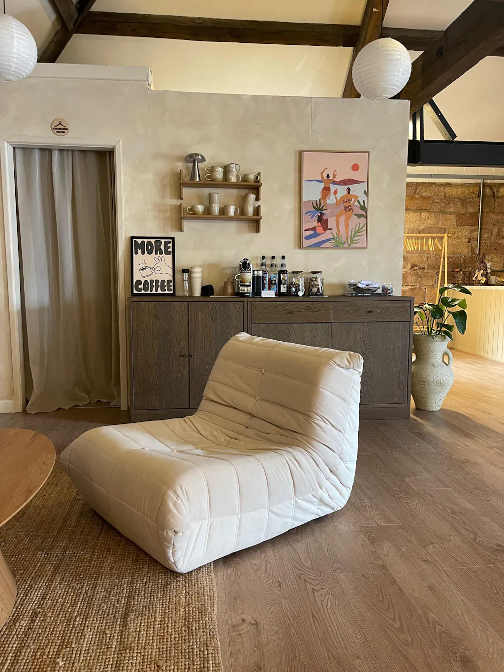
The most fundamental pairing in interior design. Wood is warm, organic, and imperfect. Metal is cool, precise, and uniform. Together they create a tension that reads as deliberate and considered.
In practice, this looks like a wooden floor lamp beside a stainless steel side table. Or a rattan coffee table with a chrome tray on its surface. The warmth of the wood and the coolness of the metal create a dialogue that makes both more present in the room.
The ratio matters. In most living spaces, wood should be the dominant material (70% or more) with metal as the accent. This keeps the room feeling warm and inviting while the metal provides punctuation. Reverse the ratio and the room starts to feel industrial, which works in some contexts but fights against the warmth that most living rooms need.
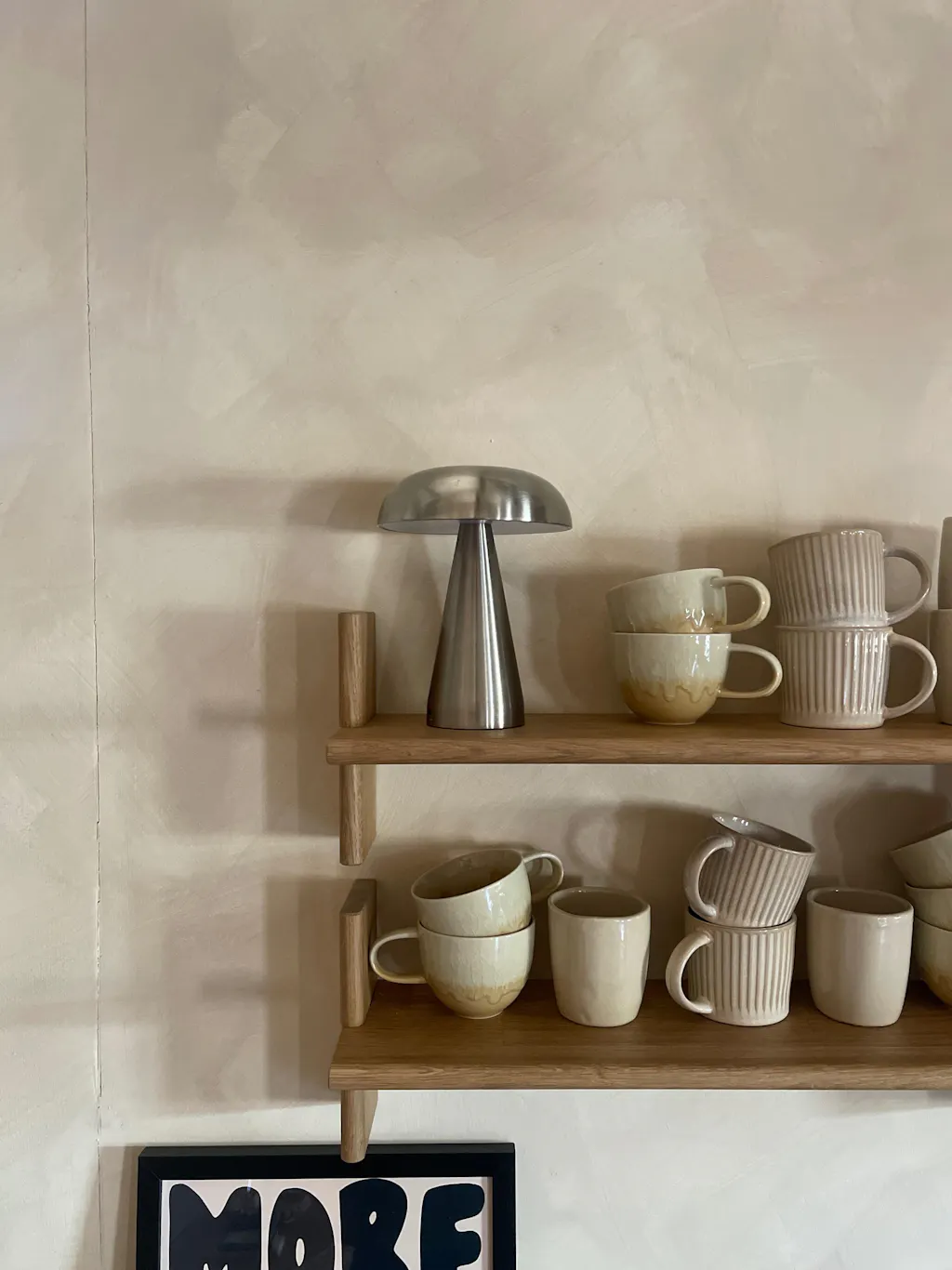
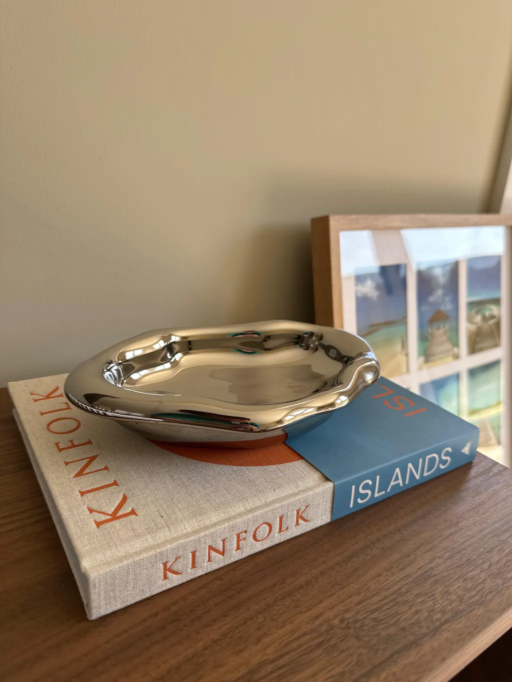
Ceramic and Metal
Raw ceramic and polished metal is one of the most visually effective pairings available. The matte, irregular surface of handmade ceramic gains definition when placed against a smooth, reflective metal surface. The metal reflects light. The ceramic absorbs it. The contrast makes both materials more interesting than either is alone.
A Cloud Nine Vase from the Bare Collection on a chrome tray is a practical example. The organic, unglazed beige of the ceramic reads as warm and handmade. The polished chrome reads as cool and manufactured. Together they create exactly the kind of material contrast that Japandi interiors are built on: the meeting point between wabi-sabi imperfection and Scandinavian precision.
Linen and Steel
Textile against metal is a pairing that works through touch as much as sight. Linen is soft, textured, and drapes with visible weight. Steel is rigid, smooth, and holds its form absolutely. The softness of one makes the hardness of the other more apparent, and the combination prevents either from dominating.
A Wabi Linen Sofa beside a stainless steel side table is the most common expression of this pairing in a living room. The linen gives the seating area softness and warmth. The steel beside it gives the arrangement structure and an edge of modernity. Without the steel, the linen risks looking too relaxed. Without the linen, the steel risks looking too cold.
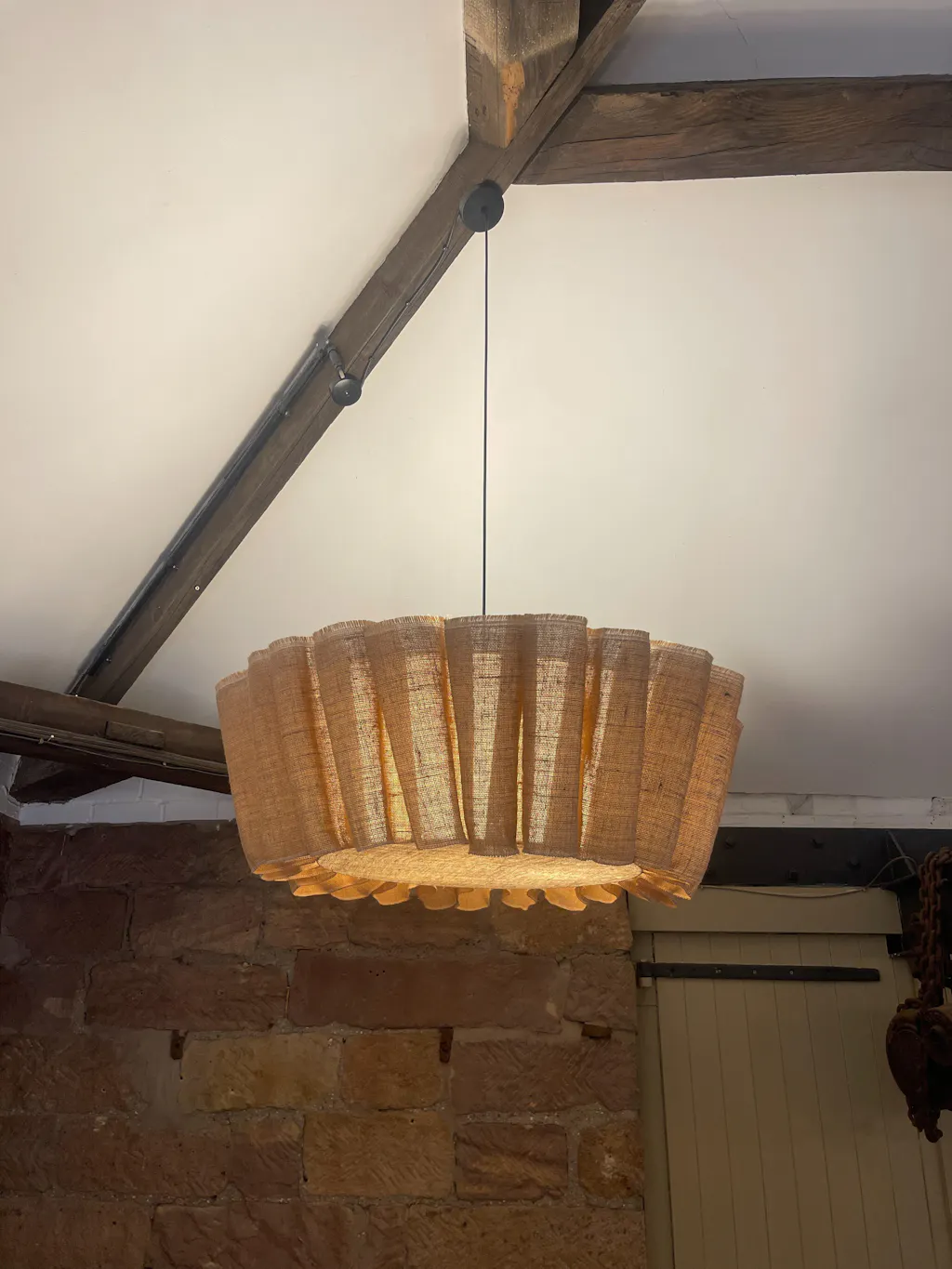
Glass and Wood
Glass introduces transparency and lightness, which makes it a useful counterpoint to the visual weight of wood. A glass vase on a wooden shelf, or a glass lampshade on a wooden base, creates a layered effect where one material is seen through or around the other.
The coloured glass candlestick holders on a wooden sideboard demonstrate this well. The glass catches and refracts light, while the wood beneath it absorbs it. The colour of the glass (blue, pink, lilac) adds a third element without introducing a third material, which keeps the composition simple while adding visual richness.
Rattan and Chrome
Woven natural fibre against polished chrome is a pairing specific to Japandi and Scandinavian design, and it is one of the most striking. Rattan has visible texture, warmth, and an artisanal quality. Chrome is flat, reflective, and industrial. The two should not work together, but they do, precisely because the contrast is so clear.
A rattan coffee table with a chrome tray and silver candle holders on its surface is a composition that contains two very different material worlds. The rattan grounds the arrangement in natural warmth. The chrome lifts it with light and precision. Neither material would make the same impact without the other.

The Rule of Three Materials
Most well-composed rooms use three primary materials. Not two (which can feel binary and stark) and not four or five (which can feel scattered and restless). Three gives you enough variety for contrast while maintaining coherence.
A living room built around linen, walnut, and stainless steel has three distinct material voices. The linen provides softness (sofa, cushions). The walnut provides warmth (a Rinkaku Floor Lamp, a shelf, a side table). The stainless steel provides edge and light (a metal side table, a tray, candle holders). Each material has a role, and together they create a room that feels layered without feeling busy.
Choose your three based on what the room needs: one dominant (usually the warmest or softest, covering 50% or more of surfaces), one supporting (30%), and one accent (20%). The accent material is the one that draws the eye. It should appear in at least two places in the room to feel intentional rather than accidental.
How to Mix Materials Room by Room
Living Room
The living room is where material mixing has the most impact because it contains the widest variety of furniture types: seating, tables, lighting, and decor. The sofa sets the dominant material (linen, velvet, leather, faux suede). The tables and lighting introduce the supporting and accent materials.
A practical arrangement: a linen sofa (dominant), a rattan coffee table and wooden floor lamp (supporting natural material), and a stainless steel side table with a chrome tray (accent metal). Three material families, clearly distributed, each doing a specific job. The lighting layer reinforces the material story: fabric shade on the floor lamp (connects to the sofa), wooden base (connects to the coffee table), while the metal of the side table picks up any chrome or steel elsewhere in the room.
Dining Area
Dining furniture tends to be more uniform than living room furniture because you buy chairs in sets and tables as single pieces. The material mixing happens between the furniture and the tableware, and between the table and the lighting above it.
A steel dining table with handmade ceramic plates and stainless steel coffee cups creates a conversation between industrial and artisanal on the same surface. The raw, uneven edges of handmade ceramics are sharpened by the precision of the steel around them. Add a ceramic candlestick holder as a centrepiece and you have introduced organic warmth to an otherwise hard surface.
On a Single Surface
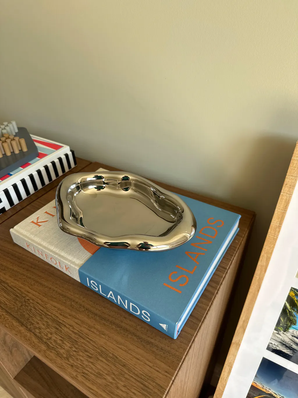
Material mixing does not require a whole room. A single shelf, coffee table, or sideboard can demonstrate the principle at a small scale.
Three objects in three materials on a shelf is a composition in miniature. A glazed Cognac Step Vase (reflective ceramic), a Bare Snout Vase (matte ceramic), and a silver candle holder (polished metal) gives you three finishes in a tight grouping. The glazed and matte ceramics contrast with each other within the same material family, while the metal provides the external counterpoint. This kind of micro-composition is what makes a shelf look styled rather than stored.

Finish Contrast: Matte, Satin, Gloss
Material mixing is not only about different substances. It is also about different finishes on similar substances. Two ceramic pieces with different finishes create as much contrast as a ceramic piece beside a metal one.
The Cognac Step Vase has a glazed, semi-reflective surface. The Dented Vase from the Bare Collection has a raw, matte, unglazed surface. Place them together and the finish contrast gives each piece definition, even though both are ceramic. The glazed surface catches light. The matte surface absorbs it. The dialogue between them is as active as any wood-to-metal pairing.
This principle extends to metals (brushed steel versus polished chrome), wood (oiled walnut versus lacquered oak), and textiles (nubby linen versus smooth cotton). Varying finish within a material family is a subtler form of mixing, but it adds depth to rooms that might otherwise feel too uniform.
Common Mistakes
Too many materials at once. A room with wood, metal, glass, stone, ceramic, rattan, and leather feels like a showroom rather than a home. Each material competes for attention and none of them wins. Stick to three primary materials, with one or two secondary ones appearing in small doses.
No repetition. If a material appears only once in a room, it looks like an accident. If the chrome tray on the coffee table is the only chrome in the room, it feels disconnected. Repeat each accent material in at least two locations. The chrome tray connects to the steel side table. The ceramic vase connects to the ceramic plant pot across the room. Repetition turns individual choices into a coherent scheme.
Matching instead of mixing. A wooden table with a wooden tray holding a wooden vase is not mixing materials. It is collecting one material. The arrangement may look cohesive, but it lacks the tension that makes a composition interesting. Introduce at least one contrasting material to break the monotony.
Ignoring temperature. Materials have visual temperature. Wood, rattan, linen, and raw ceramic read warm. Metal, glass, stone, and polished surfaces read cool. A room that is entirely warm feels heavy. A room that is entirely cool feels sparse. The most comfortable rooms balance both, leaning warm for living spaces and cooler for kitchens and bathrooms.
Forgetting texture. Two smooth surfaces side by side (glass on glass, polished metal on polished stone) create no tactile contrast. Mix a rough surface with a smooth one: a woven rattan base under a polished chrome object, or a raw ceramic vase on a lacquered shelf. Textural variety is felt as much as it is seen, and it gives a room a sense of richness that colour alone cannot achieve.

Frequently Asked Questions
How many materials should a room have?
Three primary materials is the most effective number for most rooms. One dominant (covering 50% or more of surfaces), one supporting (30%), and one accent (20%). You can introduce additional materials through small decor pieces, but the core palette of three keeps the room coherent. More than four or five primary materials risks looking scattered.
Can you mix wood tones in the same room?
Yes, but keep them within two tones of each other on the warm-to-cool spectrum. A walnut floor lamp beside an oak shelf works because both are warm-toned hardwoods. A pale birch table beside a dark ebony shelf can feel disconnected unless a third element bridges them. The safest approach is to let one wood tone dominate and use the second as an accent.
Does metal furniture make a room feel cold?
Only if there is too much of it. Metal as an accent (a side table, a tray, candle holders) adds edge and light without shifting the temperature of the room. The key is to pair metal with at least one warm material: wood, linen, rattan, or raw ceramic. In a room where warm materials dominate, metal accents provide contrast without coldness.
How do you mix materials without clashing?
Repetition and proportion. Each material should appear in at least two places in the room so it reads as intentional. Keep one material clearly dominant and let the others play supporting roles. If two materials feel like they are fighting for attention, reduce the presence of one until the hierarchy is clear. Clashing happens when no material is in charge.
What materials work best in a Japandi interior?
Japandi interiors typically build from a palette of natural wood (walnut, oak, ash), linen or cotton textiles, raw ceramic, and one cooler material for contrast: stainless steel, chrome, or stone. The balance leans warm (70/30), with the cool material providing precision and the warm materials providing the calm, grounded atmosphere the style is known for.
Shop by Material
Explore natural materials, handmade ceramics, and polished metals across the Fjord & Fuji decor collection and furniture range.
Chrome Tray | Cloud Nine Vase | Rinkaku Floor Lamp | Rattan Coffee Table | Shop All Decor