
Wabi-Sabi in Commercial Design: A Material Guide
Wabi-sabi in commercial design is one of those briefs that arrives often and lands well rarely. The philosophy gets invoked freely in mood boards and client presentations, then dissolves somewhere between concept and specification into something that is merely rustic, or imprecise, or simply unfinished. Getting wabi-sabi right in a commercial interior requires understanding what the philosophy actually asks of a space, and then translating that into a coherent material and finish language that performs under the demands of sustained commercial use.
This guide covers the core materials, the finish decisions that make or break the aesthetic, and the common mistakes that undermine otherwise well-intentioned schemes.
What wabi-sabi actually means for specifiers
Wabi-sabi is a Japanese worldview, not a style checklist. It holds that beauty is found in imperfection, impermanence, and incompleteness. Wabi refers to the beauty of simplicity and asymmetry; sabi to the beauty that comes with age and wear. Together they form an aesthetic that values what is honest, natural, and time-touched over what is polished, synthetic, or pristine.
For a commercial specifier, this translates to three principles that should govern every material decision.
Materials should be natural and legible in their nature. Linen, solid timber, hand-thrown ceramic, woven hemp: each of these shows its origins and its making. A lacquered veneer surface does not.
Imperfection should be structural, not incidental. A hand-thrown bowl with an uneven rim is a wabi-sabi object. A mass-produced bowl with a chip in it is not. The distinction matters because wabi-sabi spaces require considered selection rather than a relaxed attitude to quality control.
The space should improve with use. A linen sofa that develops a natural patina over time is more wabi-sabi after three years of occupancy than it was on installation day. A white-painted surface that marks and scuffs is not wabi-sabi; it is simply poorly specified.
The materials that carry wabi-sabi in commercial interiors
Linen and natural textiles
Linen is the single most versatile wabi-sabi material available to a commercial specifier. Its natural weave irregularity, the way it creases in use, and the way it softens over time are not defects; they are the point. For upholstery, linen performs best in commercial settings when the specification accounts for its character in context. On lounge furniture, natural creasing reads as warmth and invitation. On tight-back dining chairs, that same quality can read as neglect. Match the textile to the application.
The Wabi Linen Sofa in Stone is the clearest example in our range of how linen upholstery performs in commercial settings. The stone colourway absorbs minor soiling more gracefully than the Milk White, which matters in hospitality applications where cleaning intervals are less frequent than in residential use. For cushioning, layered linen and woven covers add texture depth without visual noise.

Solid timber
Visible wood grain is fundamental to wabi-sabi material language. The specification decision is between wood that has been processed until its origins are obscured, and wood that remains legible as a material. Lacquered veneers fail the test. Oiled or waxed solid timber passes it.
Walnut is the commercial sweet spot: warm enough to read as inviting, structured enough to avoid looking rustic. Oak at the paler end of the scale works well in Japandi-inflected commercial interiors where the Scandinavian functionalism note needs to come through alongside the wabi-sabi material philosophy. For furniture with structural timber frames, the grain and joinery should be visible. A chair where the construction is concealed behind flush panels communicates something different from one where the tenon and stretcher are part of the visual composition.

Hand-thrown ceramics
Ceramics are where wabi-sabi philosophy is most immediately visible in an interior. Mass-produced pieces, however well designed, carry a uniformity that reads as industrial. Hand-thrown work carries the trace of its making: slight asymmetry in the rim, variation in glaze pooling, subtle differences between individual pieces in a set.
For commercial tabletop, this creates a deliberate aesthetic statement. A handmade mug on a hotel breakfast tray reads differently from a uniform stacked set. For decor and accessory styling, a hand-thrown piece is often doing more visual work per object than anything else in a scheme. The Mura Hand-Thrown Ceramic Plate with its deliberately uneven rim is the kind of object that communicates a specifier's intent the moment a guest picks it up. Our handmade tableware range covers mugs, bowls, plates and dishes in a stoneware finish that varies intentionally between pieces.

Woven natural fibres
Woven hemp, rattan, and jute bring structural texture to a scheme without adding colour or pattern. They sit within the wabi-sabi material family because they show their construction: the individual fibres, the weave pattern, the variation in tension that hand-weaving produces. In commercial applications, woven pieces work best as accent furniture and lighting rather than primary seating. A woven lounge chair in a hotel lobby reading corner or a short-let living room will last well. The same chair as primary restaurant seating will not. The Aki Rattan Cane Lounge Chair is the right specification for that first application.

Natural plaster and limewash wall finishes
Wall finishes are often the largest surface area in a commercial interior and the one most underspecified in wabi-sabi schemes. Smooth emulsion on plasterboard reads as residential and slightly flat. Limewash and natural plaster introduce depth, tonal variation, and the quality of light absorption that wabi-sabi wall surfaces require.
Limewash is also practical from a maintenance standpoint. Small marks and variations blend into the surface rather than requiring touch-up painting to a specific matched colour. In boutique hotel and short-let applications, this is a meaningful operational advantage over standard emulsion.

Finishes to specify, and finishes to avoid
Specify: oiled or waxed solid timber; unglazed or softly glazed ceramics; natural linen and hemp; limewash or tadelakt on walls; brushed or patinated metal in aged brass or black iron.
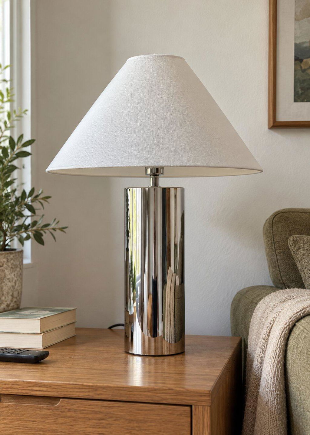
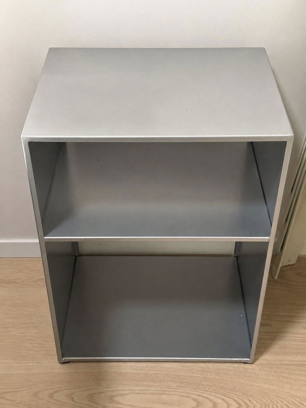
Avoid in a wabi-sabi scheme: high-gloss lacquer on any surface; mirror-polished metal; uniform machine-woven textiles; synthetic veneers intended to pass as solid timber; acrylic or resin surfaces of any kind. These materials communicate the opposite of what wabi-sabi requires. They aspire to a perfection of finish and conceal their origins.
The harder call is polished concrete. Polished concrete has wabi-sabi adjacency but sits closer to industrial minimalism. Raw or brushed concrete with visible aggregate variation is more within the philosophy. For hard flooring specifications, wide-plank solid timber or textured natural stone reads more naturally as wabi-sabi than poured and polished concrete.

Wabi-sabi across different commercial settings
Boutique hotel bedrooms
The bedroom is where wabi-sabi material philosophy has the strongest impact on guest experience. Linen bedding, a solid timber bedside surface, a hand-thrown ceramic for the water glass: each is a tactile moment the guest registers on arrival and throughout their stay. The cumulative effect of considered material choices across multiple touchpoints produces the sense of care that drives review scores. For a full specification guide, our boutique hotel buyer's guide covers the complete process from furniture to accessory styling.
Hotel lobbies and common areas
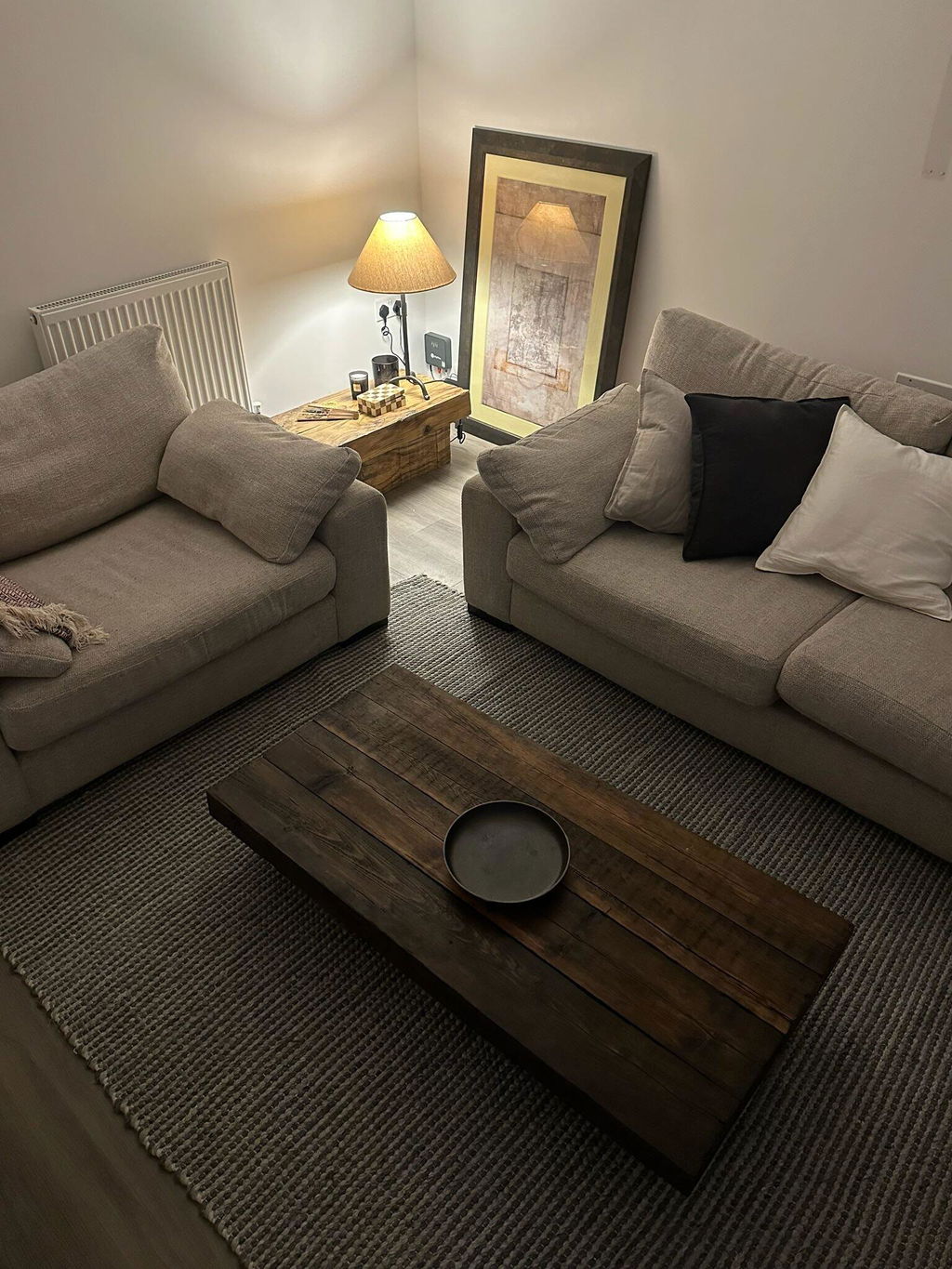
Lobby applications work best when wabi-sabi materials are concentrated in the furniture and soft furnishings rather than the fixed architecture. A lounge corner with a linen sofa, a woven accent chair, a fabric floor lamp, and a ceramic accessory grouping delivers the aesthetic without requiring structural change to the building fabric. The Kose Fabric Floor Lamp in particular suits this application: its diffused warmth shifts the register of a corner from functional to considered without the installation requirements of fixed lighting.

Restaurant and café interiors
Wabi-sabi in food and beverage settings translates to handmade tableware, natural timber surfaces, limewash walls, and pendant lighting with visible natural material construction. The specification challenge here is durability. Commercial tables take serious daily use. Oiled solid timber is the pragmatic finish over raw or waxed, and the specification should include a maintenance schedule from the outset so that the natural evolution of the surfaces reads as intentional rather than neglected.
Short-let and holiday let properties
Short-let operators benefit from wabi-sabi materials for a specific commercial reason: they photograph better than alternatives at similar price points, and listing photography drives occupancy more directly than any other variable. Linen, solid timber, handmade ceramics, and fabric lighting all produce warm, textured photography that reads as premium regardless of a property's actual size or location. Our short-let playbook covers room-by-room specification in detail.

The durability argument for natural materials in commercial use
The objection raised most often against natural materials in commercial specification is durability. Linen marks. Timber scratches. Ceramics chip.
The counter-argument is that wabi-sabi materials age rather than degrade. A linen sofa that has been sat on several hundred times looks as it should look. A tight-back chair in synthetic velvet that has begun to pill and flatten does not. The materials were not specified to a pristine standard that can be visibly compromised; they were specified to a natural standard that they continue to meet.
The practical consideration is maintenance expectation. Natural materials require periodic care: oiling timber surfaces, laundering linen slipcovers, replacing ceramics that chip. These are lower-cost interventions than refinishing lacquered surfaces or re-upholstering with materials that cannot be refreshed. Build the maintenance requirement into the client brief at specification stage rather than discovering it during snagging.
For a broader discussion of how wabi-sabi and quiet luxury compare on this dimension specifically, our post on Japandi vs quiet luxury covers the material ageing argument in detail. For the deeper, moodier commercial register specifically, our guide to dark Japandi covers palette and lighting for atmospheric hospitality spaces.
Common specification mistakes
Specifying wabi-sabi by surface only. Limewash walls with synthetic upholstery and plastic accessories produces a scheme that looks confused rather than considered. The philosophy requires coherence across all material decisions, not just the wall finish.
Confusing wabi-sabi with rustic. Raw brick, exposed conduit, and reclaimed timber pallets are not wabi-sabi. They belong to industrial or salvage aesthetics. The distinction matters for tone: wabi-sabi is refined and quiet; those aesthetics are not.
Over-accessorising. Wabi-sabi spaces have negative space. The impulse to fill surfaces with natural objects produces clutter rather than calm. One considered ceramic object is more powerful than twelve.
Selecting materials for their showroom appearance rather than their behaviour in use. Unfinished timber grey over time. Natural linen softens and creases. Hemp weaves loosen slightly with sustained use. These are features of the aesthetic, but they need to be named as such in the client brief so that the evolution of the interior reads as intentional.
Specify for your project
A selection of wabi-sabi-appropriate pieces from the Fjord & Fuji range, specified for commercial and hospitality use. For trade pricing and project support, visit our trade page.
- Wabi Linen Sofa Two Seater, Stone from £2,300
- Aki Rattan Cane Lounge Chair from £340
- Kose Fabric Floor Lamp from £690
- Handmade tableware collection


Frequently Asked Questions
What is wabi-sabi in commercial interior design?
Wabi-sabi is a Japanese philosophy that finds beauty in imperfection, impermanence, and natural materials. In commercial design, it translates to a coherent material specification using natural textiles, hand-thrown ceramics, solid timber, and woven fibres rather than polished, synthetic, or uniform finishes. The goal is an interior that reads as warm and intentional and that improves with use rather than showing wear as degradation.
Are wabi-sabi materials durable enough for commercial use?
Yes, when correctly specified. Natural materials age rather than degrade: linen softens, timber develops patina, ceramics carry the trace of use. The durability consideration is maintenance expectation rather than material fragility. Oiled timber, laundered linen slipcovers, and occasional ceramic replacement are lower-cost interventions than refinishing lacquered surfaces or re-upholstering with synthetic materials that cannot be refreshed.
What is the difference between wabi-sabi and Japandi?
Wabi-sabi is a Japanese philosophical worldview; Japandi is a design aesthetic that combines Japanese wabi-sabi principles with Scandinavian functionalism. Japandi is the commercial and visual language that carries wabi-sabi values into interior specification. Most commercial interiors described as wabi-sabi are more accurately described as Japandi: they draw on the philosophy but combine it with the structural clarity and functional rigour of Scandinavian design tradition.
Which wall finish works best in a wabi-sabi commercial interior?
Limewash and natural plaster are the strongest choices. Both introduce tonal variation and depth that smooth emulsion cannot produce, and both improve practically in commercial settings: minor marks blend into the surface rather than requiring matched touch-up paint. Tadelakt is appropriate in wet rooms and spas. Standard matte emulsion can work if the budget does not allow for specialist finishes, but it will flatten the overall material composition.
How do you avoid wabi-sabi looking unfinished in a commercial setting?
The distinction between wabi-sabi and unfinished is intentionality: every material decision should be deliberate and coherent. Specify natural materials that show their nature by design rather than incidentally. Ensure the scheme has negative space rather than filling surfaces. Avoid mixing wabi-sabi materials with synthetic or high-gloss elements, which immediately reads as inconsistency rather than philosophy. One considered ceramic object and one textile layer at a time is more effective than assembling a large collection of loosely related natural objects.