
Dark Japandi: The 2026 Direction for Moody Interiors
Dark Japandi has arrived. The aesthetic that spent its first years in pale, airy, neutral registers has shifted, and the 2026 iteration is darker, moodier, and arguably more resolved than its predecessor. Charcoal walls. Smoked timber. Dark-glazed ceramics lit by warm, layered lamplight. The philosophy is unchanged; the palette has deepened. Understanding what dark Japandi actually requires, in terms of materials, lighting, and palette decisions, is the difference between a scheme that feels immersive and one that simply feels dim.
What dark Japandi actually is
Dark Japandi is not Japandi with dark paint on the walls. It is the same philosophical foundation, wabi-sabi's embrace of natural materials and imperfection combined with Scandinavian functionalism and restraint, expressed in a deeper, more saturated tonal register. The shift is in palette rather than in principle. The materials remain natural, the negative space remains deliberate, the objects remain considered. What changes is the light register: from pale and airy to warm, layered, and immersive.
The distinction matters because dark rooms executed without the underlying Japandi philosophy tend to feel oppressive or theatrical. Dark Japandi feels grounded. Natural materials absorb rather than amplify the depth of the palette, and warm layered lighting counteracts any sense of heaviness. The result is immersive rather than claustrophobic: a room that draws you in rather than closes around you.

The palette
Dark Japandi does not mean black. The palette sits between deep charcoal and forest green, with specific tones that carry the aesthetic most reliably.
Deep charcoal and ink are the anchor tones. These are warmer than black and deeper than grey; they read as inviting rather than cold. On walls, they absorb light in a way that makes a room feel intimate without shrinking it visually. The warmth is critical: a cool charcoal tips the scheme toward industrial; a warm charcoal stays within the Japandi register.
Forest green and moss are the most interesting addition to the dark Japandi palette in 2026. These are deeply muted, almost brown-green tones rather than the brighter botanical greens of earlier interior trends. They carry more wabi-sabi character than straight charcoal, particularly when paired with natural timber and linen. In a commercial setting, moss green reads as distinctive in listing photography without the risk of alienating guests the way a very dark charcoal can.
Aged walnut and dark-oiled oak are the timber directions. These are not paint choices but finish specifications for any timber in the scheme: deeper, warmer, with visible grain that reads as rich rather than rustic. Lighter oak that works well in a pale Japandi room can look washed out against a charcoal wall; walnut-finish timber holds its presence.
Cognac, amber, and deep ochre serve as accent tones. A single ceramic object in warm amber glaze against a charcoal wall does more visual work than an entire shelf of pale objects in a light room. Restraint with colour compounds in a dark scheme.
For UK paint references: Farrow and Ball Railings, Down Pipe, and Studio Green sit within the dark Japandi palette. Little Greene Obsidian and Off-Black are also within range. What to avoid: cool greys (they tip the scheme toward industrial minimalism), true black (too stark, loses the warmth), and anything that reads as shiny or reflective rather than matte and absorbed.

Materials in the dark register
The same material principles that govern standard Japandi apply in the darker iteration. Natural over synthetic, visible construction over concealed, materials that age rather than degrade. The specific expressions shift.
Linen in the stone, charcoal, or deep olive colourways replaces the pale neutrals of the lighter aesthetic. The Wabi Linen Sofa in Stone is the pivot point between the two registers: it reads naturally in a pale Japandi scheme but holds its own against a deeper wall colour because the stone colourway carries enough warmth to bridge both. For a full dark scheme, adding darker cushion covers deepens the composition without requiring a different sofa entirely. The Kohi Herringbone Cushion Cover in Caramel, the Edo cover in Maillard Brown, and the Ichi cover in Walnut all sit within the warm, deepened palette the aesthetic calls for. For more on building a complete look around a linen sofa, our guide on how to style a linen sofa covers the layering principles in detail.

Smoked or dark-oiled timber is the structural material of the dark Japandi palette. Walnut and blackened oak carry visible grain while reading as deep and warm rather than rustic. The Aki Rattan Cane Lounge Chair in Walnut brings both elements together: the walnut-finish frame anchors the timber note while the hand-woven rattan cane seat maintains the natural material philosophy that the darker palette requires. The same cane-on-dark-frame pairing works at the dining table, and our rattan dining chairs buying guide covers how to choose them.
Solid timber tables carry the dark register at a larger scale. The Kura Solid Wood Plinth Table and the Hira Solid Wood Coffee Table bring substantial, grounded timber mass into the centre of a scheme. In a dark room their solidity reads as sculptural rather than merely functional, particularly when the surrounding palette is restrained enough to let the form and the grain do the work. We follow one Hira from reclaimed boards to finished table in From Timber to Table.

Dark-glazed ceramics are where the accent palette lives. Hand-thrown pieces in deep glazes, unglazed stoneware, or warm amber finishes read as more resolved in a dark scheme than pale or pastel ceramics. The Cognac Step Vase is the single piece in the range most directly suited to a dark Japandi scheme: its architectural stepped form and deep amber glaze function as a warm counterpoint to charcoal or forest green walls, providing exactly the kind of considered accent the aesthetic calls for. The Sora Pleated Ceramic Vase in Indigo offers a cooler but equally deep alternative, its muted indigo glaze sitting comfortably against forest green or charcoal without breaking the warm-led palette.


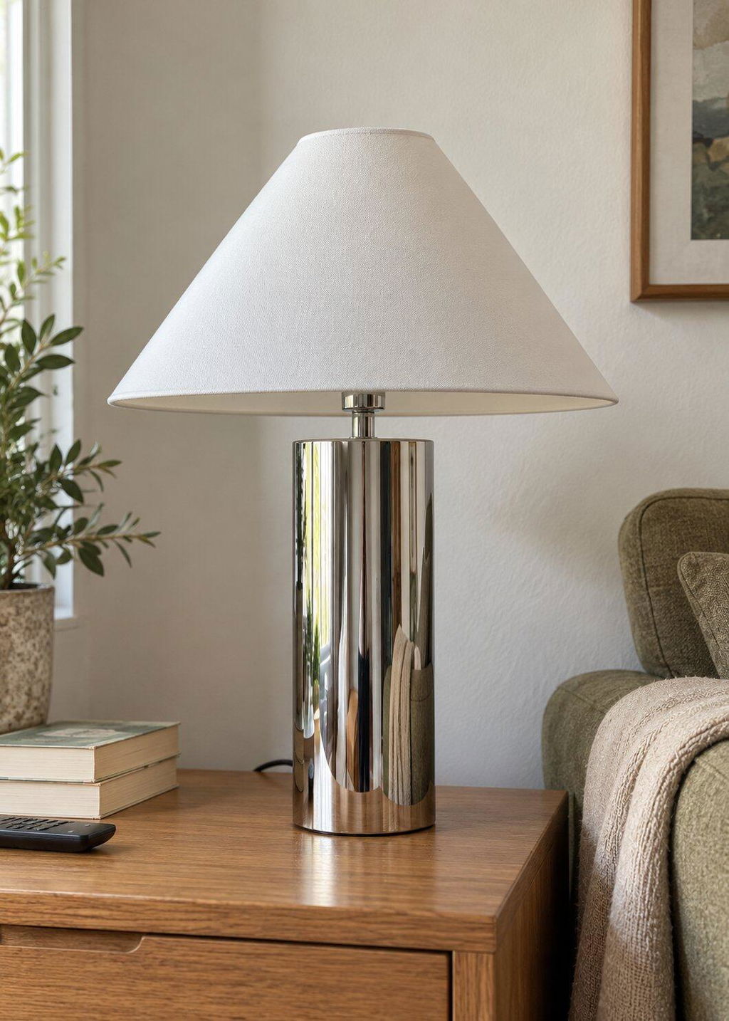
Patinated and blackened metal rather than polished chrome. Brushed black iron and aged brass sit within the material language of dark Japandi; mirror-polished metal does not. The finish should look as though it belongs rather than was recently installed.
Lighting is the deciding factor
More than any other element in the scheme, lighting determines whether dark Japandi works. Dark walls absorb light, and the instinctive response of adding more overhead lighting destroys the aesthetic entirely. A dark room lit by recessed ceiling spots looks like an underlit office. The correct approach is layered warm lighting at low and mid height, with overhead illumination either absent or minimal.
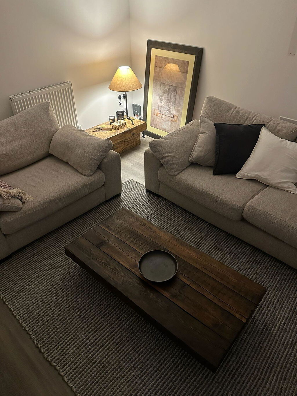
Multiple floor and table lamps rather than overhead illumination. The goal is pools of warm light that create contrast within the room rather than an even wash of brightness across it. This is where Japandi's material philosophy and its visual effect align most closely: a wooden floor lamp with a fabric shade produces the kind of diffused, directional warmth a dark scheme requires, using materials that belong within the aesthetic rather than contradicting it.
Bulb temperature matters more in a dark scheme than in a pale one. The correct range is 2200K to 2700K, very warm white and close to candlelight in quality. Cooler temperatures, even at 3000K, shift the scheme toward something clinical.
The Tsuki Wooden Floor Lamp is the anchoring piece for a dark Japandi lighting scheme. Its sculptural stacked column base in dark-finished solid timber reads as intentional rather than purely functional, and produces warm, directed light suited to a dark room. The Rinto Wooden Floor Lamp offers a similar material proposition at a different scale. For the softest ambient warmth, the Kose Fabric Floor Lamp produces the most diffused light output in the range, suited to bedroom and hospitality lounge applications where atmosphere takes precedence over task lighting. Where a room does need a central light, keep it soft and hung low: the Kumo Gathered Fabric Pendant Light diffuses light through gathered fabric rather than throwing it straight down. The full range is available in our lighting collection.

If you are moving from a pale, well-lit room to a dark Japandi scheme, the number of light sources typically needs to increase rather than decrease. Two floor lamps and a table lamp in a living room is not excessive in a dark scheme; for many rooms, it is the minimum for the space to read correctly.
Dark Japandi for commercial and hospitality interiors
For boutique hotels, restaurant operators, and short-let owners, dark Japandi offers a specific commercial proposition that the lighter iteration does not.
Dark rooms photograph differently. The combination of deep walls, warm lamp light, and natural material texture produces listing photography and editorial images that are immediately distinctive. In a market where most boutique hotel bedrooms have converged on the same light, airy, neutral aesthetic, a genuinely dark Japandi room stands out in search results and on booking platforms. For properties that rely on platform-driven bookings, this is a meaningful commercial advantage.
The immersive quality of a dark scheme converts differently from a light one. Guests entering a dark Japandi room experience a transition: from a corridor or a standard hospitality environment into something that feels genuinely considered and separate. This sense of arrival is commercially significant in boutique hospitality where the guest is partly paying for that experience.
Dark Japandi is also well suited to specific commercial applications where lighter interiors are not the strongest choice: spa and wellness spaces, restaurant and bar environments, cinema or screening rooms, and short-let properties that want to perform strongly on autumn and winter bookings specifically. In these contexts, the palette actively serves the experience the guest is purchasing rather than simply providing a neutral backdrop.
The material durability case for dark Japandi in commercial use is the same as for standard Japandi: natural materials age rather than degrade. A dark-oiled walnut chair that has been used commercially for two years looks as it should. For the full case on material specification for commercial settings, our post on wabi-sabi in commercial design covers the specification considerations in detail, and our boutique hotel buyer's guide addresses the furniture and accessory decisions specific to hospitality.

Japandi with dark floors and dark wood
Dark Japandi does not have to start with the walls. Plenty of homes already have the dark element built in: stained floorboards, a walnut kitchen, inherited dark wood furniture. The question then is not how to go darker but how to keep the room calm around what is already there.
With dark floors, keep the walls lighter than the floor, in warm off-white, stone or a soft clay, so the room has a clear base and does not close in. A large rug in a lighter, natural tone, flatweave or low wool pile, breaks up the expanse of dark boards and gives the seating area its own ground. Linen in stone or oatmeal on the sofa then sits between the two.
With dark wood furniture, the rule is to commit to contrast or to match, never to land in between. Timber that is clearly lighter than the floor, or close to the same depth, reads as intentional; two browns that are almost the same look like a mistake. In our view one dominant dark timber per room is plenty, with the other wood tones treated as accents. Warm, low lighting matters more here than anywhere: dark timber under a cool overhead bulb looks flat and heavy, while the same piece beside a warm lamp shows its grain.
How to introduce dark Japandi without a full commitment
For residential buyers not ready to commit to dark walls throughout, the aesthetic can be introduced in stages without losing its essential character.
A single dark accent wall in a living room or bedroom achieves most of the visual impact of a full dark scheme. The placement matters: a sofa against a charcoal wall reads as intentional. A charcoal wall opposite a pale sofa reads as an experiment that has not yet resolved. Position dark walls behind the main furniture arrangement rather than facing it.
Dark timber furniture in a pale room introduces the deeper material register without changing the wall colour at all. A walnut lounge chair and a wooden floor lamp against a pale wall is a dark Japandi composition in a light room. The palette is held in the objects rather than the architecture, which makes it entirely reversible.
Ceramic objects in dark or warm glazes are the lowest-commitment entry point. A single cognac or deep amber piece, positioned with enough negative space around it, carries the principle of dark Japandi at the scale of an accessory. This is where the aesthetic begins for most people before it scales to a complete room.
The move from standard Japandi to dark Japandi is a deepening rather than a departure. The same material choices, the same restraint, the same preference for natural over synthetic: all of these remain. The palette moves lower in the tonal register and the lighting responds accordingly. For more on how the underlying Japandi philosophy relates to other aesthetics sharing the same tonal space, our post on Japandi vs quiet luxury covers the distinctions in detail. To take the moody palette into the busiest room in the house, our japandi kitchen ideas guide applies the same restraint to worktops, cabinetry and open shelving.

Shop the dark Japandi edit
Pieces that anchor a dark Japandi scheme, available now.
 Wabi Linen Sofa, Two Seater
 Aki Rattan Cane Lounge Chair, Walnut
 Kura, Solid Wood Plinth Table
 Hira, Solid Wood Coffee Table
 Tsuki, Wooden Floor Lamp
 Cognac Step Vase
 Sora, Pleated Ceramic Vase, Indigo
 Kohi, Herringbone Cushion Cover, Caramel
Frequently Asked Questions
What is dark Japandi?
Dark Japandi is the deeper tonal evolution of the Japandi aesthetic. It applies the same philosophical foundation, natural materials, imperfection, restraint, and negative space, to a palette of deep charcoals, forest greens, smoked timber, and dark-glazed ceramics. The result is warmer and more immersive than standard Japandi while retaining the material honesty and considered curation that defines the aesthetic.
What colours are used in dark Japandi?
The core palette runs from deep warm charcoal and ink through forest green and moss, with dark-oiled walnut as the primary timber tone. Accent colours are warm rather than cool: cognac, amber, deep ochre, and aged brass. Cool greys and true black sit outside the palette. For UK paint references, Farrow and Ball Railings, Down Pipe, and Studio Green are within range.
How do you light a dark Japandi room?
Layered warm lighting at low and mid height rather than overhead illumination. Multiple floor and table lamps using warm bulbs in the 2200K to 2700K range create the pools of directional warmth a dark scheme requires. Wooden lamps with fabric or natural material shades reinforce the material philosophy while producing the diffused quality of light the aesthetic needs. Recessed overhead lighting contradicts the scheme entirely.
Does dark Japandi work in small rooms?
Yes, when the lighting is correct. Dark walls in a well-lit small room feel smaller; dark walls in a room lit by layered warm lamps feel intimate rather than cramped. The key is ensuring the light sources create contrast within the space rather than attempting to compensate for the dark walls by illuminating everything evenly. Generous negative space in the furniture arrangement also counteracts any sense of the room closing in.
Is dark Japandi suitable for commercial and hospitality interiors?
Particularly so in the right applications. Dark Japandi rooms photograph distinctively well against the market standard of light neutral hospitality interiors, which is a direct commercial advantage for platform-driven bookings. The aesthetic is especially well suited to spa and wellness spaces, restaurant and bar environments, and short-let properties targeting autumn and winter seasons. The material specification considerations are the same as for standard Japandi: natural materials, layered lighting, and considered curation at every scale.